Skip over navigation


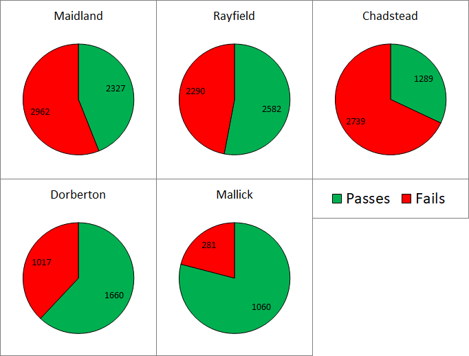
Looking at the pie charts
Just looking at the second pie chart, Rayfield had the most passes - more than a quarter of all passes.
However, if you look at the first pie chart, you can see that a lot of people took their test at Rayfield (around a quarter), so you would expect a lot of people to pass.
What we are interested in is the number of people who passed relative to the number of people who took their test there - so the centre where the wedge on the second pie chart is largest relative to its wedge on the first pie chart - which is Mallick.
Working out the pass rates
Using the numbers from the pie charts, we can find the pass rates for each centre.
This is the percentage of tests which were passed:

Driving Test
Age 14 to 16
ShortChallenge Level 

Looking at the pie charts
Just looking at the second pie chart, Rayfield had the most passes - more than a quarter of all passes.
However, if you look at the first pie chart, you can see that a lot of people took their test at Rayfield (around a quarter), so you would expect a lot of people to pass.
What we are interested in is the number of people who passed relative to the number of people who took their test there - so the centre where the wedge on the second pie chart is largest relative to its wedge on the first pie chart - which is Mallick.
Working out the pass rates
Using the numbers from the pie charts, we can find the pass rates for each centre.
This is the percentage of tests which were passed:
| Test Centre | Tests Passed | Tests Taken | Pass Rate |
|---|---|---|---|
| Maidland | 2327 | 5289 | 44% |
| Rayfield | 2582 | 4872 | 53% |
| Chadstead | 1289 | 4028 | 32% |
| Dorberton | 1660 | 2677 | 62% |
| Mallick | 1060 | 1341 | 79% |
We can see that Mallick has the highest pass rate.
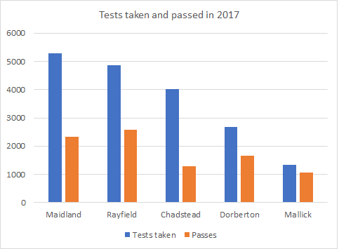
Other ways of respresenting the data
Bars showing tests taken and passed at each centre:
You can find more short problems, arranged by curriculum topic, in our short problems collection.
You may also like
Gambling at Monte Carlo
A man went to Monte Carlo to try and make his fortune. Is his strategy a winning one?
Marbles and Bags
Two bags contain different numbers of red and blue marbles. A marble is removed from one of the bags. The marble is blue. What is the probability that it was removed from bag A?
Coin Tossing Games
You and I play a game involving successive throws of a fair coin. Suppose I pick HH and you pick TH. The coin is thrown repeatedly until we see either two heads in a row (I win) or a tail followed by a head (you win). What is the probability that you win?